Showing posts with label Type. Show all posts

8/01/2007

Real Weddings


This really looks like a great event. I really get a feel for who these people are by looking at these pictures. I love their take on a photobooth (see her bio for details) I love the ceremony backlighting, I love the cardbox. But do you know what I love most of all? (This is how I know Lyndsi is rubbing off on me)..Her Fonts! I love on the cookie tags and her place cards she either found a friend with cool handwriting or used a handwriting sort of font. It looks very casual but purposefully casual. I love it, it's kind of quirky and those things do stand out. Check out the lovely Mrs. Julia Goolia

7/19/2007

Invitations and Placecards and Menu's, Oh My! Volume 1.


OK, I have been asked to post some information about type and layouts in regards to event invitations. I started doing some research so I could provide some useful information and also some pretty pictures to maybe inspire some of you or at least entertain...Well, I got very involved and realized that this is not going to be one simple post. No. There is so much fantastic info and imagery out there that could not only inspire invitations or menus, but also the whole vision of your event. Therefore, there will be multiple postings about this issue to come, but I will start out with the basics. Today I will discuss alignment:
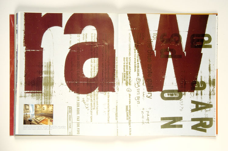
The first thing a graphic designer learns - don't center text on a page (but if you do, try to make it interesting, like this). In most cases, centering can come across unoriginal. Centering text is what we designers refer to as 'static', meaning that it is stuck on the page as just a mass of matter that simply does not flow. So instead of centering your information, consider something else. Here are some ideas....
This is called making text 'dynamic'. Anything. Left Justified. Maybe Right Justified (maybe). Have some of the text going off the page, make certain words bigger or bolder. Make certain letters red. Of course you need to have form (the look) and function (it needs to make sense), but have fun with it and be creative. I have provided some examples of interesting invites from Bird and Banner and Two Paper Dolls, above. I will not advertise centered type...well, unless it's this by Bird and Banner, one of my newest fave Philly based company's right now.
xx Lyndsi

7/10/2007

Hello, I'm Lyndsi and there are 'Fonts All Up in My Face'


Hello SocialDesign family, friends, and fans. This is the first time I am blogging on our blog and I am super excited. For someone who generates a good amount of her creativity via the computer, I am just now spreading my wings into actually posting in blogland. Life is funny like that, but I'm sure in no time you will be bombarded with fabulous and fantastic news, info and fun stuff from yours truly.


On that note, I'll start out with something very dear to my heart: Type. There is nothing that makes me more excited than good type layed out well (note: just say no to centering!!!) Anyhoo, I came across the most amazing tool for graphic design and type lovers and novices alike, Type Selector is designed as if it was a paint chip selector, but divided into all of the type categories (my favorite being Sans Serif, of course) , each card containing various font sizes, letters/numbers as well as dummy text. It looks like a great resource that I will definitely be getting my hands on soon!